Tuesday 15 December 2009

Final Digi Pack


This is my Digi pack, I feel comfortable with how it has come out and believe that I have taken a lot away and learnt a lot about how to use the programmes which aid you in constructing the digi pack. I have taken away knowledge which I will be able to use in future projects. I feel that the digi pack is similar to that of its genre and meet the criteria needed.


The pages run from bottom to top - starting with the one called "play time's over"

Friday 4 December 2009

Evaluation

In what ways does your media product use, develop or challenge forms and conventions or real media products?
In the fast growing music industry, the need to have entertaining and dynamic music videos is a high priority if it hopes to achieve well: especially as a lot of sales are now made by through royalties from music channels which depend on the song having a video. I felt it important to stick to the main conventions of a music video (well lit, repeatability factor, continuity, good editing and most importantly that it fits within the genre) and to try to meet them in a professional way.

Dub step is fairly new on the scene and is still quite an underground scene. As a result of this there are not many videos out there commercially made. I had to give my video an upbeat yet urban feel. I filmed it in an urban area and utilised all of the surroundings. These included tower blocks, deserted garages and terraced housing add to the feel of the piece. I felt it necessary to try to meet as many of the conventions as I could to give it a professional feel. As well as keeping the audience entertained it’s important to have a narrative playing a long side the performance. I decided to have the main narrative playing with short clips of performance cut into it to act as an ellipsis of time in the narrative, but also to keep the audience entertained. I did this by using various close up of the DJ decks from different angles, sometime using a first person shot of the decks to help the audience feel included; or sometimes a close of the needle dropping onto the vinyl. Steve Archer wrote about the impact which narrative and performance have on a music video. He talks about how the narrative compliments the performance, but that it is the performance which is at the heart of the piece and gives a sense of reality to the band members.
As well as the storyline, it’s important to make sure the clarity of the footage and the lighting is of a good standard. I did this by filming in good day light; however I felt it was originally too light so I changed the lightness of the piece by tampering with the effect controls. The change was subtle, but definitely gave the piece a darker more sinister feel; this was further backed up by the nearly black and white shots of the performance.

The only other genre which is loosely connected is dance music and within their music videos they use fast editing. This inspired me to use lots of small clips and cut them together to give a fast and continuous feel.

As well as this, I decided playing the footage back then playing it in real time was a worthwhile effect that really gave the piece a really professional look. This was done on various shots. The first being when antagonist jumps over the wall to chase the protagonist, this is the start of the main narrative so I drew attention to this by rewinding it then playing it back. It gave it a more modern feel and definitely suited the genre highly. I used various short clips in quick succession to aid continuity and give it a quick and precise edge. I was mainly inspired to do this via Pete Fraser who said that having a montage of shots which on their own make little sense but together create a detailed plot and this is how you gain the attention of the audience and keep them entertained.

How effective is the combination of your main product and ancillary texts?
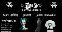
My ancillary texts were formed by closely looking at other websites and albums of a similar genre. The predominant colour was black or dark blue; the dark representing the hard urban lifestyle and the blue which symbolises the police and the link between the two. I chose to have predominantly black and white on my website. I believe the two colours complement each other and also represent a “good” and a “bad” side to the urban underground scene.

Meeting the conventions were a priority and I felt that is must also be in conjunction with the genre. Like many other websites today, tour dates were an obvious part of my website. They clearly laid out when the dates were and were presented in an easy to find way. The use of graffiti and urban fonts gave it that extra edge which made it seem similar to the genre.
I felt it important to meet the criteria of the exam board but felt it increasingly difficult as many of the websites regarding this genre are rather minimalistic, so I had to strike a balance between the two. I did this by sticking the colour scheme of just black and white with only one other colour prominent (the green on the joker). This drew the attention of the audience to the centre of the screen, from which they would feel more intrigued to view the rest of the site.
I felt it important to have at least one image of Dub Fiend on the website and on the album cover. My main inspiration to do so was from Dyer who said “The incoherence of the star image ensures that audiences continually strive to ‘complete’ or to ‘make sense of’ of the image.” Having a picture of the artist really gives a sense of normality and reality to Dub Fiend, making him seem more accessible and personal. This can be linked heavily to the theory of Negus, who proposed that there are two types of artist: synthetic and organic. By having a photo of Dub Fiend, graffiti font and a small quote from him, it creates more of a rapport with the audience and rendering him as an organic artist.

The “scruffy” writing and the blurred roll over on many of the fonts on the website give an impression of normality and urban lifestyle which is known to be rough cut and hard. This font is also prominent in the album which shows the link in the production stage between the website and the album.

I use subtle advertising on my website. This came in the form of a flash made t-shirt which different Dub Fiend logos on, or the advertisement which encouraged people to try to “win tickets to our next set.” I felt this gave it a rather professional feel and made it look more realistic. As the music industry is slowly losing money by illegal downloads, it is ever more important to create an appealing music video which can be sent to the people like MTV, but equally to have a strong album and website to back it up.

What have you learned from your audience feed back?
My audience feedback helped me greatly to realise where I had gone wrong and also to know in the future how I can improve my camera, editing and photo composition. I obtained my feedback in class. I played the footage and showed them the album and website, I then documented the feedback. Many people commented that the filming had a good mix of performance and narrative and liked the transitions between the two to form a subtle ellipsis of time. However some people felt that ellipsis of time was too subtle and could confuse the audience as to the time line of the narrative. If I was to do this again, I would be sure to make the time scale of the narrative clearer to the audience. Another point was the wide use of shots which complimented the chase scene and acted as a third person view which the audience could observe the chase scene from various angles and perspectives. If I was to make another similar piece I would make sure I had more footage to work with, as towards the end of my editing process I found I had too little and as a consequence my piece was shorter than intended. However this pushed me to work on my editing ability to try to get more out of the footage I had. Another comment made was that despite the fact I had no lyrics, my piece managed to keep the audience well entertained. I tried to do this by having a constant narrative complimented by the performance element.

My website took a lot of careful planning and thought. I tried to keep it within the genre whist meeting the criteria of the mark scheme. Many people commented that its minimalism was like that of its genre and fitted it well. Despite this, some people commented that it in the middle of the page, a few of the pictures and animations were too close together and gave it a clustered feel. This could be avoided in future by taking more time to learn how to use the programs better to allow me to get the desired effect. I spent a lot of time creating flash animations, one of which was a t-shirt, the other being a text animation used to advertise a gig. This was noted by the audience and commented that they liked it. I came to grips with using fireworks in order to create innovative texts and make them distort or blur when the cursor was moved on to them, this was noticed by the audience and was well liked. However in other instances, the text used to write the tour dates was deemed to be effortless and that I could’ve used a more modern text rather than “times new roman”. This would be changed if I was to do it again. The audience overall liked the set up of my website and felt it suited my song and the genre which I chose. I was happy with my efforts and have taken away constructive criticism to aid me in future construction of websites.

My album was considered to be very simplistic by those who viewed it. It incorporated one of the main symbols used on my website. People commented that the original image used on the front cover was slightly dull and needed to stand out more. If I was to do this again, finding a better original image would be a priority. The second point made was that of the album name “play time’s over”, which was actually spelt “play times over”. This was due to a problem with the font and if I had the time again I would rectify it. Positive comments were made about the fonts on the back cover used to display the song titles. This was accompanied by the picture of the joker which is prominent on the website, again showing the link between the two pieces. If I was to do this piece again I would try harder to gain a better original image and have planned better to allow me more to time to create a better front cover.

How did you use new media technologies in the construction and research, planning and evaluation stages?
Planning was an important stage to me, as I realised last year when making an opening to a film and all the extras that were needed with it that planning was essential. I set about by using Google to search all genres associated with dub step and garage. I further filtered my search by using Google to make search more specific to Dub Step, more importantly to find out if there were any people making this genre of music locally. With the advances in internet social networking I managed to hear of someone who is originally from Nottingham who makes his own dub step music who now goes to university. I got in touch with on Facebook and asked if it was okay to use some of his music to make my video with. He gladly accepted and I began to use YouTube to search for current videos from the genre.

As I trawled through page after page I slowly started to realise that it is because Dub Step is still not very commercial and as a consequence, not many videos have been made. I then looked to the closest other genre which would be garage or grime. This taught me that an urban setting would definitely be needed. Using Google maps I researched different areas of Nottingham and viewed them on “street map” so I could decided properly. This saved me a lot of time and meant I could easily save the pictures from the computer and add them straight onto my digital blog which was used to document my efforts during the planning stage.

When it came to constructing my piece I used Dreamweaver to create a number of boxes and columns. These allowed me to position and align all of my images (acquired from Google) and texts. Having heard that I could get innovative and urban-like fonts off of the internet, I began to browse Google. I eventually found “Dafonts.com” which allowed me to take fonts and use them on my website. However in their raw form I felt they were not adequate so I imported the images into Fireworks and used an invert colour effect and learnt how to use the roll over tool in order to make the image change when the cursor moves over it. I did a similar thing with my image of the joker which I played with the saturation and colour balance. This gave it a more dark and sinister feel which really went with my urban, dub step themed website.

Creating my music video required me to view other videos of a similar genre. As I stated before, there were limited videos of the genre due to it being new on the scene. I made a story board which I was able to scan and upload to my online blog. Having a blog really aided my organisation and made everything easily accessible. I set out to film on location using the camera equipment and tripod which I used my knowledge from last year to create different angled shots to give the desired effect.

Once the filming was finished I began to use Premierpro to capture my filming and begin to edit. I started by laying all my shots out in order and then using the razor tool to get rid of the of the stuff I did
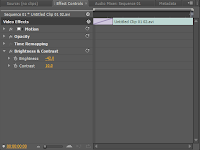
n’t need. The program is made it very easy to chop and change certain aspects of the filming. I continually used the colour editing to dim down the footage to give it a darker feel to go with the genre. This was done by adding on “colour HLS” and “colour balance” which aided my to gain the effect I needed. To make sure the video went with the music I sometimes slowed down the video or play it back then play it back in real time to give it a more “modern-urban feel”. The beauty of YouTube is it allows anyone and everyone to view your video for free and for extremely easily. Digital distribution aided me not only through allowing others to access my work on YouTube, but also in my organisation from my blog. This has aided many other film and music distributors and had brought the media industry a long way since the days of keeping film stored on tape.
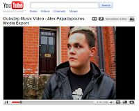
This is a link to my YouTube video which I uploaded to that easy viewing was possible.

The evaluation stage was made a lot easier by the help of blogging. This not only helped me to acquire all of the necessary information needed to put into my evaluation, but it made it easier to put it all into the evaluation straight from the blog. The images and print screens you can see present within my evaluation are taken from my blog. Similarly to the distribution of the films in recent times, all our work is being sent off and examined digitally. This is far more efficient and reliable.

Final Draft - Website


This is a print screen of my website. As you can see, it has come a long way from the original edit. I decided to change the back colour to black to go along with the general theme which runs throughout the digi pack and website, where the predominant colour is black. The joker still remains on the website however is not the main image. This is replaced by a photo of myself posing as Dub Fiend. Even though it is not obvious on the print screen, there are a number of animations present. This was done through using flash. I still stuck to the minimalistic ideas which I layed out at the start and made sure I included as much of the critea asked of me. I also made changes to the website after I had feedback given to me from my class. These were things like: needing more informative text. I made these adjustments and then had a piece I am happy with.

Thursday 3 December 2009

Permission from Fraser Mills (Dub Fiend)


This is a print screen of the email I received from Dub Fiend which states I have permission to use the track "Syncopath".

Friday 27 November 2009

Friday 9 October 2009

Story Board


These are the pages used to plan out my initial ideas for my shots. They outline briefly what I plan to do and have a small bit of text to go with it.

Thursday 1 October 2009

Shots of location


Here are two shots of where I intend to shoot my video, as you can see they are slighly urban and incorperate a tower block. They have surrounding areas which could allow for on the spot inspiration to take place. Not only the tower block itself, but the garages and small grassy area near it. This will prove usefull when filming here and suits the genre of my piece.

Wednesday 30 September 2009

Draft of website


Before I went ahead and began to make my website, I thought it best to make a mock up of my website. Here is an initial plan and has the basic principles of what I wish to include in my website. In the blank gaps at the side of the picture I wish to have promotional ticket offers and gig dates. This will help it to look more original and more like a real website. I would wish these things to be flashing and attracting attention.

Sunday 27 September 2009

Album Cover Analysis


The Kings of Leon album cover, incorperates all the members of the band on to one image. The picture used is that of a bald eagle, which has long been a symbol of America and their strength. I believe the kings of leon used this as a symbol of their firm patriotism and then used their faces on the picture to show that they were at one with it. It also represents their unity as a family and shows that they are all under "the same wing" so to speak.


The Foo Fighters' album is very simplistic. It incorperates one main imagage with minimal text to accompany it. The bomb looks to be similar to a light bult, possibly symbolysing the new ideas that the band may have had. The bomb represents the bold statement which this band will make with its release.

Music Video Analysis

Cascada - Dangerous

The Camera starts off with a soft zoom into a room incorporating a long shot used to get all of the scene into view, this is accompanied by a soft whispering noise which goes well with the shot. The camera then cuts to a mid shot of the artist who is standing in a darkened room in front of some ornate wall paper. The lighting makes it seem more romantic and the intro to the song adds to this. After a few seconds the camera does a fast cut to a man putting a jacket on, this is obviously meant to tell us that the song is directed at him and we can now have a sense for the narrative. As the base kicks in the editing becomes a lot more fast and intense. The camera soon moves to an over the shoulder shot of the artist looking at a computer screen where a camera is following the man(symbolising that the woman has no trust of where the man is going). This feeling is backed up by the lyrics: "you're so dangerous". As the man leaves the house there is a long shot in a slightly low angle, giving the impression of the dominance the man has over the woman, the long shot is used to show the house but also the expensive cars he's driving. As the guy walks into the house long shots are used to show all the extravagant props that are on show, such as large paintings on the wall. To look aesthetically pleasing to the eye, the editing team has changed shot to go on the beat in some instances, this gives a sense of precision but also continuity. The camera then becomes rather disorientated and pans across different shots to form a sense of panic or direct acton. One shot used is one of the artist driving very fast in her sports car, which symbolises her revenge her will to find out the truth by being direct (in this fast car). The man and the other woman move into a room and are filmed using a mid shot to get them both in from waist height but also to show some of the surroundings. The colours used throughout are mellow and nonthreatening apart from the yellow sports car which the artist drives, which again represents her lack of conformity and drive to find out the truth, even if it means going against the norm (the other mellow colours). One of the last shots used is that of the artist and the man together. She stands over him in a provocative manner and seems to hug him but by doing so, steals something he has taken. The way that she is stood over his is symbolic of the shift in power. The black leather jacket which he was wearing before has now gone, he's now left in just in a t-shirt, almost as if he has had something stripped of him (his dignity) and now he's powerless. The video finishes with the artist driving off in her yellow car using long shot to get the extravagent house on show.

Wednesday 23 September 2009

Video Analysis

Birthday Sex

The camera starts off with a tracking shot moving into a room, slowly revealing a camera being set up. The camera then moves to an over the shoulder shot of a woman walking into a room, the camera moves down her body and cuts from her to a man singing the song. The camera cuts between the man, the woman’s behind and a bed; allowing the audience to get a feel for the genre and the connotations being conveyed in the video. The video is full of pragmatical shots, to many people a glass of champagne and strawberries is considered to be romantic and sexual which is one reason I believe it has been included in there. The man in the video is often accompanied by the woman in many of the shots and she’s often caressing him in a sexual manner or they either find themselves in rather compromising positions, adding to the general feeling of the video, however this is not surprising when you find out the title is “birthday sex”.
The clothes they are both wearing are considered to be fashionable for this year however the way in which the camera focuses on certain parts of their body which makes it seem sexual. The editing is cut in such a way that it changes scene on the beat. This makes it seem more continuous and flows better.
Its constant referral to fruit and presenting it in a sexual way is only more proof of what this video is trying to portray, this is further confirmed by the introduction of shots of a bed. The camera being pointed at the bed also has sexual connotations
The lyrics convey many sexual meanings also: “You say you want passion, I think you found it, Get ready for action.” These show that the song it souly centred around sex and sexual things. Dyer wrote about how stardom can affect the way in which they act and “sexual magnetism” is highly evident in the video.

Sunday 20 September 2009

Actors Who Will Feature


The first of actors who will feature in my piece is Jamie Brice. As a fellow media student he understands the different conventions which make a successful piece. Convinientlty he can also drive, making doing tracking shots and parts of the chase scene a lot more simple. He has also got experience in acting and theatrics as he is a drama student at a college near by.

The second person who will be featuring in my piece is Billy Abbott. He does not have any media experience, but his enthusiasm to be part of this means a sure commitment to the piece. Both of the actors will be wearing similar clothing to that I have written about below.

Wednesday 16 September 2009

Fiming schedual


Here is a table I drew up, briefly describing the allocated time and plan of each filming date.

Risk Assessment


As filming can often go wrong for numerous reasons, I have drawn up a risk assessment to hopfully make filming smoother and less accident prone. I have listed the risk, the likelihood and the solution. This I hope will prevent such things (as listed in my risk assessment) from happening.

Tuesday 15 September 2009

Props


Although props do not feature highly in the piece, the narrative is based around a prop. The main prop is the CD which is used as the link between the chase scene and the music, it offers some level of clarity to the audience and gives an slight inclination as to what may happen in the video.
The second prop is a means of transport to different locations but also acts as a intensifier in the chase scene. It will also be used to help with a tracking shot which will be used in the video.
The final are some DJ decks which will aid me in the performance part of my video but also gives a sense of completion to the video.

Friday 11 September 2009

Costume Choices


The costume I have chosen is mainly black and features a hoodie; a main element of street and urban clothing. A black beanie is also in use, just as it adds to the urban feel of the piece. The other two guys who will be giving chase in the video will be wearing similar stuff, possibly with a white t-shirt.

General Idea for Video

The general narrative of the video is as follows: a guy walks out of a shop holding a CD in his hand. He puts the CD into a music player and puts his head phones in. As soon as this happens the music begins to play. The man walks away and two men start to give chase to him. A chase scene develops as the camera switches between a first person view and various camera angles to give the impression of a intense chase. The man running believes that he’s got away from the guys, but they soon find him and the chase scene continues. Finally the man loses the two guys giving chase and he enters into his house and begins to mix the song into some DJ equipment. The song finishes...

Mind Map of Ideas


Here is a mind map of some intial planning ideas for my video.

Wednesday 9 September 2009

Research Into Websites


The first website is that of Dub Fiend and is on MySpace. He uses this as his main means of distribution and advertising. On it there are many of his tracks to listen to for promotional purposes. The layout of his MySpace is dark and slightly urban, which goes well with the type of music produced by Dub Fiend. It’s also minimal which suggests that his music is also similar; we can see this to be correct when we listen to tracks such as “the beginning of the end.” Importantly, it has his contact details and his most recent sets. The feeling I get from it is that it is not only a means of distribution, but highly focussed around advertising his name as a DJ/producer. There is a small section which shows who dub fiend is associated with, in “my friends.” This helps him to be easily categorised into a Dub step genre as well as to make friendly connections within the industry.

The second website I have chosen to view is “bare dubs records”. Similarly to that of the site of Dub Fiend’s it is minimalistic and uses similar colours, which makes me think that black and dark blues are particularly urban colours therefore used a lot of the time on sites such as these. On “bare dubs records” there is a small write up on their purpose and a little about their history. Its main focus is to sell dub step music but as a result of this advertise the artists more by having links to MySpace pages of theirs.

Tuesday 8 September 2009

Research Into Target Audiences


I have conducted a survey amongst my peers in order to get an idea as to who I am directing my piece towards, but to also gain an idea as to how commercial dub step has become in the last few years. The results show that since its main launch in 2005, dub step has reached the ears of many people, in fact fifteen out of the seventeen people I asked had heard of it, however only nine from the seventeen asked liked it which tells me that even though dub step has come on leaps and bounds in popularity in recent years, the audience is still selective. All the people asked agreed that a chase scene within the video would look good, but all said that it would only be suitable to some songs.

Monday 7 September 2009

Music Video Dirrectors


Michael Bay (born February 17, 1965) is an American film director who is most famous for making large budget action films. Some of his more notable films include such titles as: Armageddon, The Rock, Pearl Harbor, Bad Boys, Bad Boys II, Transformers, and Transformers: Revenge of the Fallen. However, he is also famous for making many music videos; one of these was actually for the sound track to him film, Pearl Harbor. When he can he also likes to appear in the film as an extra or a very small role. His films are often big and dramatic with lots of explosions and special effects. This is apparent in some of his music videos, one being the video to the song “There you’ll be” which uses clips from the film Pearl Harbor.
http://www.michaelbay.com/


Anthony Mandler is an American music video director. He has worked with many top RnB artists as well as some of the top names in hip-hop. He graduated from USC Film School and realised his passion for photography. Whilst in the industry he gathered a lot of contacts and before long he found himself directing music videos. His videos often include many semi naked models, which is typical of the genre of hip-hop and RnB. However whilst making the video to “Beautiful” by Eminem, there is none of this which suggests that he is more than capable to make a serious music video to accompany a song.
http://www.youtube.com/watch?v=AOAL2lLBKqM

My Chosen Artist


The artist which I have selected is a Dj/producer from Nottingham. He goes back by the name of “dub fiend” and is looking to release his songs via digital means. He constantly looks for inspiration around him which can lead his music in a different direction. The song which I have chosen is called “Syncopath” and can be found on Dub fiend’s MySpace and on YouTube. Dub fiend’s real name is Fraser Mills and is currently situated in Nottingham, which was how I heard of him. The majority of his music is distributed via digital means or posted onto the internet where he hopes internet recognition may arise. If Dub fiend was to be signed by the numerous record labels out there, the most likely would be Tempa, Soulja, Road or Vehicle; as these all specialise in Dubstep or Grime.
http://www.myspace.com/dubfienduk

Friday 4 September 2009

Music Video Music Genres


Dub step is a type of music originating in London in the early 2000s. Its major influence comes from Garage, another type of UK urban music. Dub step uses a lot of snare drum sounds which it has taken from other genres such as Grime. Its focus on the base often makes it seem quite dark and accompanied with an average of 140 beats per minute, means that it is eligible to have high tempo areas to the song. Dub step is often played in a minor key, which gives a harsh, slightly aggressive tone which goes well with the urban street scene from whence it came.

Dub step videos are often centered around criminal activity happening on the street. They utilise its aggressive sound to create a feeling of hardship and wrong doing. The videos are often full of emotion and sometimes anger. (http://dancetechnomusic.suite101.com/article.cfm/what_is_dubstep)